Process:
I decided to go with the background that I selected because I liked how it was kinda rustic and had good shapes. In this process it was fun to go back and see all the projects that I have previously completed. It is fun because I am able to see the progress that I have made from project to project. I chose AR Destine font to go with the project because it goes well with the over all theme of the slides. I ended up changing the font to Arial bold. The AR destine was kind of hard to read. Sister Esplin suggested that so i changed it.
Critique:
After I submitted my first slide deck I was able to get great feed back. I received feedback from Karen and Christine on Facebook. I was also able to get critique from Sister Esplin. I made alot of changes from what everyone suggested. Like I said I changed my font. I also reworded my final slide. I also re sized a lot of my images so the spacing was even from the edges of the power point. After the changes I made, it made it look a lot better. I had fun building this portfolio. Thanks
Magazine Spread Final


Draft Critique:
I received good feed back from Sister Esplin and Chaz. I could seem to get anyone to comment on my FB post so I asked for some feed back from people who work on campus at the computer lab they gave me better feed back. I was able to make a lot of changes. As you can see there are a lot of changes I made compared to my wire map and also from my original. In my video you will hear what major changes I made from the critique I received back.
Image Source:
http://www.greenworld365.com/
http://www.deviantart.com/browse/all/?q=Tribal
Other images are my own.
Font:
titles- Apple Chancery, Subtitles/body copy-Ariel Regualr
11A Web Page Layout


Process: I started out by thinking of what business I should build this web site for. It was an easy decision. I decided to make a website for our ranch. Making the button tabs or link tabs were easy because those are the main functions of our ranch. I figured it was be good to use photos that I have taken on the ranch that pertain to the buttons or links that are located up above on my web page layout. The audience I am trying to focus on is people who are not familiar with the west or ranch life. By clicking through this web site someone who knows nothing about ranch life can get a perspective of what its all about at a very shallow depth. Ranch life equals hard work, I love it. I took my project to the lab located in the library. In the commons area I was able to get a lot of help from the lab assistants just by asking them questions about how to do things in Photoshop.
Critique: I was able to receive critique from Chaz and my roommate Clint Urick. He is a communications major and gave me great feed back and ideas. I was also able to get good feed back from Sister Esplin. I changed a lot compared to what I first sketched out and wire mapped. I received critique on my sketch from Chaz Egnew as well
Color Scheme: Compliment Brown/Blue
Fonts: Poor Richard/Kefa regular
Movie Poster 10A CHIZM
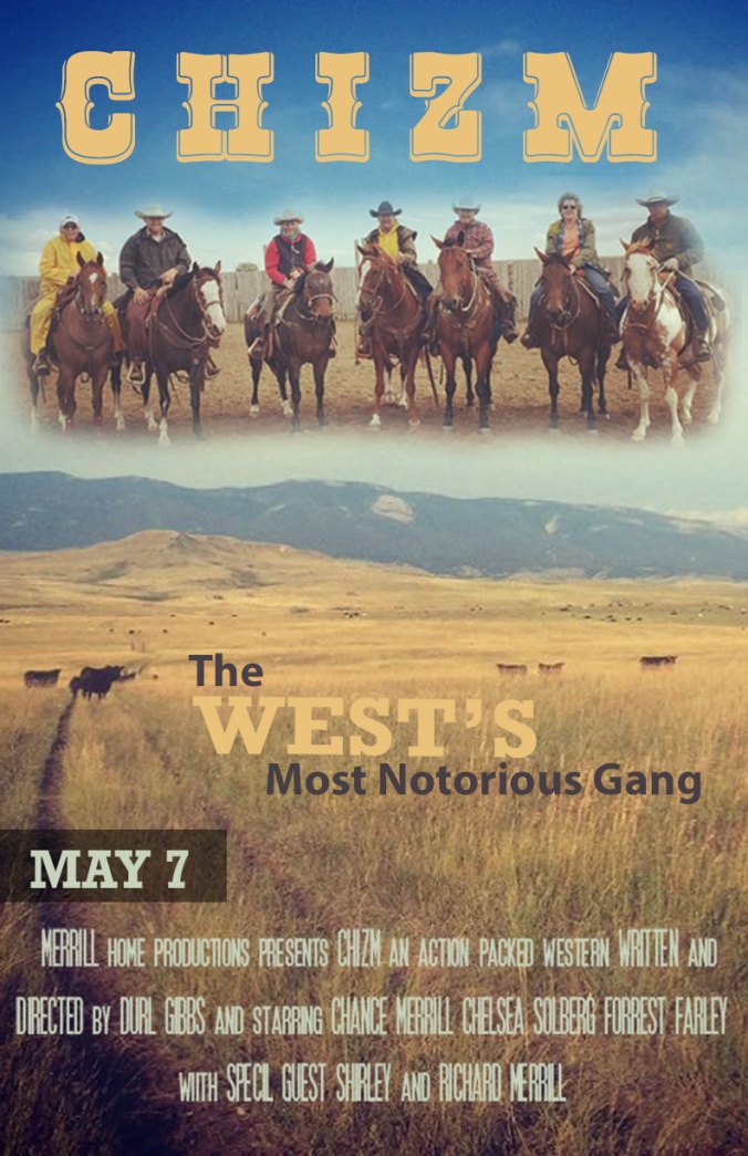
Message/Audience: I am the second rider from the left to right just to clear that up. This is a photo of some family friends, we got together for a team sorting. The movie title is Chizm because the area where I took that background image is some land we own that we call Chizm. For this poster my audience is towards those individuals who like action packed movies. Individuals who enjoy a little comedy and action all in one. The message that I am trying to portray through this movie poster is how amazing the west really is. Im also trying to portray an old style western movie that is based in today’s day and age. This is a story about a gang located in Montana that tries to prove to the west that they are good men, a group of bandits that work towards restoring peace in the west amongst corrupt deputies and sheriffs.
Critique Report: I was able to receive awesome critique from sister Esplin as well as Chaz and Melissa. Chaz suggested that I fix some of the words in my poster and locate them somewhere else. They use to be up on the mountains but I brought those down and made them more bold. I put in new graphic elements, as well has moved “May 7” to the left hand side of the poster rather than centering it. I used the masking and fading tool. Originally I started using the cut out tool but I received guidance from people in the computer lab.
Fonts: Sub titles- Rockwell Bold seriff, Title- Rio Grande Bold decorative
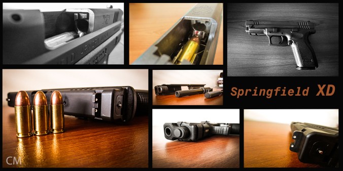
9A Photographic Study Project

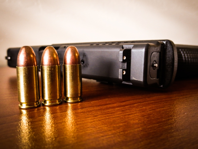

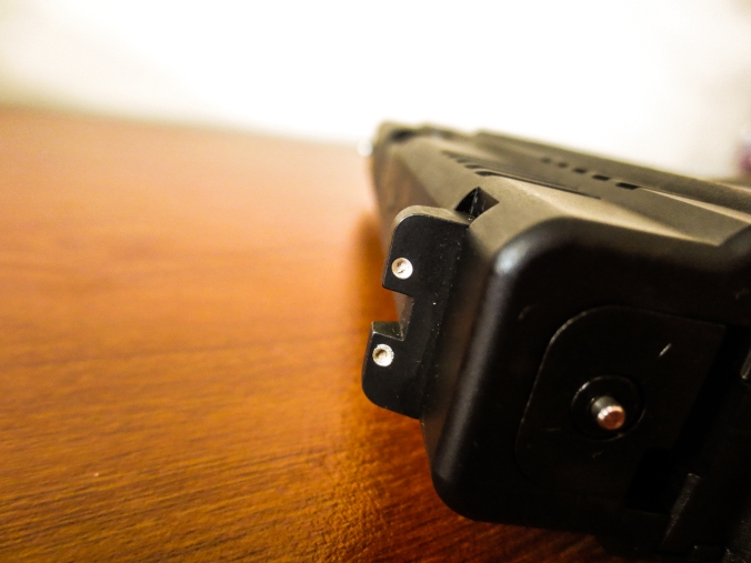
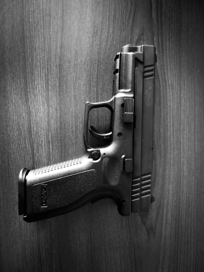

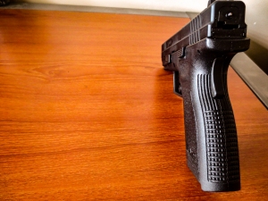


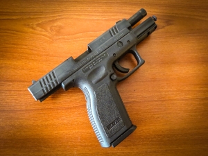
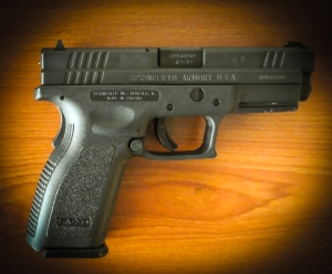
Process:
As I was deciding what I should take pictures of I looked down and saw my pistol in its case. I figure this would be a good object to take pictures of on my desk because the lighting seemed to be just right at that time. I placed the gun on my dark red wooden colored desk and that brought the blackness of the pistol out which I wanted. The red tinted desk top the golden bullets and the jet black pistol made for awesome color mixes. I wanted to add some black and white photos in there because I wanted the pictures it be rustic looking and it went along with the colors on the project. I was critiques by my good Christine Settles and Karina Finke as well as Melissa Ziegler thanks. I enjoyed doing this project. I also went to the computer lab and had help on this project from students that knew how to do Photoshop.
LFC Photography Activity
 Background in focus

Foreground in focus
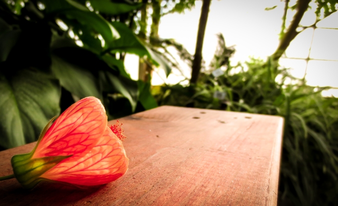
leading
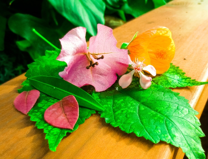
Rule of Thirds
Outdoor Lighting
Indoor Lighting
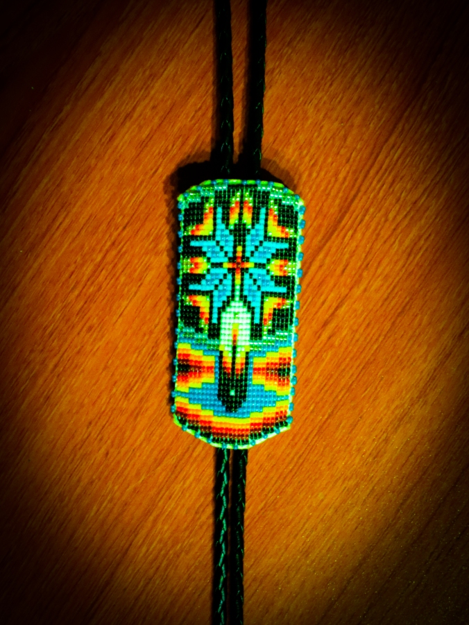
Taking these photos were fun. I went to the green house on the campus here at BYU-Idaho and found the leaves and the flowers. Hopefully I didn’t get in trouble for picking the flowers and leaves off some of the plants. Light room is an awesome tool for editing photos once you understand how to run it. I love native american jewelry or designs so I liked this photo of indoor lighting of a beaded bolo tie. I tried to bring out the colors in it. I really like how the leading photo has a glowing effect in the flower. I tried to bring that aspect out as well.
Social Media Marketing Project
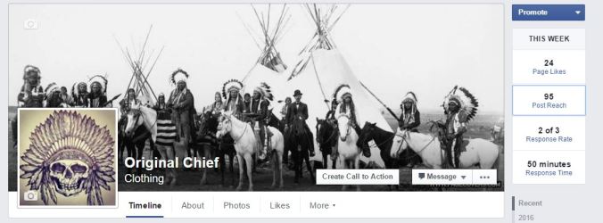
Company: Original Chief Clothing
Objective: Create awareness of the company new company Original Chief Clothing. Create awareness through generating a theme on Facebook. To help customers foster the idea of who their chief is.
Strategy: To post pictures of historic chiefs, with the aim to get people to think about the Original Chief. Our strategy is to get people to think of the company O.C.C when they think of any kind of Chief. Through the phrase “Whos Your Chief” customers will began to associate that with Original Chief. To get customers to choose who inspires them.


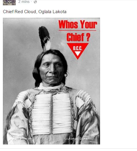
Process & Reasoning: The whole idea behind this is to promote awareness of a clothing line that I am trying to build. I started this a month ago with the idea of creating tribal images and tribal art on t-shirts. This is becoming very popular as you can see in pac sun and the buckle. I chose to use the idea and phrase whos your chief so people become aware of the company O.C.C. I have always been fascinated with native american culture and designs and I feel like promoting awareness of well know chiefs is a good way to promote this brand. There were many great native american chiefs throughout history that were some of the best leaders and commanders. I think they should be recognized. This was my reasoning for selecting just a few of the most well known leaders of the Americas. I originally wanted to use other historic figured such as Abraham Lincoln and Rosa Parks in order to get more audience. The phrase “Whos your Chief” is an invitation for my audience to decide who their leader is. Who inspires them.
Critique Process: Originally I had different images selected as well as font type. I had Abraham Lincoln and Rosa Parks but those didnt seem to fit with what my theme was. I also put the wording in a different location and color. This made it more readable. I got rid of a decorative font I originally had to a more simple straight forward font. My original images we also squished looking I fixed that. I was able to receive great feed back from Chaz Egnew and David Achibald. They gave me many tips and new ideas. Chris Armstrong also gave me reliable feed back about the location of my words.
Image Source:
https://www.washingtonpost.com/opinions/the-washington-red-clouds-a-team-name-to-honor-a-great-warrior-and-leader/2013/11/01/292f20c4-40e3-11e3-a624-41d661b0bb78_story.html
https://en.wikipedia.org/wiki/Sitting_Bull
Magazine Content and Sketches
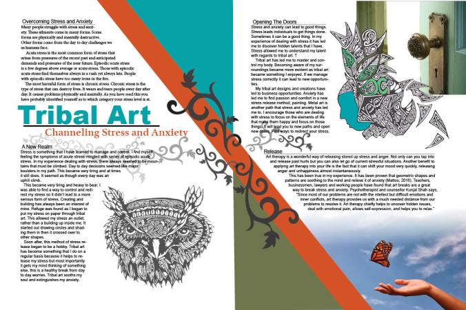
In this project my audience is to those who deal with stress and anxiety. Everyone deals with some levels of stress in their lives at different degrees. The purpose of my magazine article is to help those who need a way to channel their stress. This article is one that I wrote. I feel passionate about it because it has helped me. This type of article could go in a New Era or a church related print. Using tribal designs and art really does help those with stress. Stress causes many mental and physical problems in peoples lives. This may help those people. Some of the images are just the surface of some of my tribal art designs that have come because of my experience.
STORY: Tribal Art, Channeling Stress
Overcoming stress and Anxiety
Many people struggle with stress and anxiety. These ailments come in many forms. Some forms are physically and mentally destructive. Other forms come from the day to day challenges we as humans face. Acute stress is the most common form of stress that arises from pressures of the recent past and anticipated demands and pressures of the near future. Episodic acute stress is a few degrees above average or acute stress. Those with episodic acute stress find themselves always in a rush yet always late. People with episodic stress have too many irons in the fire. The most harmful form of stress is chronic stress. Chronic stress is the type of stress that can destroy lives. It wears and tears people away day after day. It causes problems physically and mentally. As you have read this you have probably identified yourself as to which category your stress level is at.
A new realm
Stress is something that I have learned to manage and control. I find myself feeling the symptoms of acute stress mingled with series of episodic acute stress. In my experience dealing with stress, there always seemed to be mountains that must be climbed. Day to day decisions seemed like major boulders in my path. This became very tiring and at times it still does. It seemed as though every day was an uphill climb. This became very tiring and heavy to bear. I was able to find a way to control and redirect my stress so it didn’t lead to a more serious form of stress. Creating and building has always been an interest of mine. Refuge was found as I began to put my stress on paper through tribal art. This allowed my stress an outlet, rather than a building up inside me. It started out drawing circles and shading them in then it crossed over to other shapes. Soon after, this method of stress release began to be a hobby. Tribal art has become something that I do on a regular basis because it helps to release my stress but most importantly it gets my mind thinking of something else, this is a healthy break from day to day worries. Tribal art sooths my soul and extinguishes my anxiety.
Opening the Doors
Stress and anxiety can lead to good things. Stress leads individuals to get things done. Sometimes it can be a good thing. In my experience of dealing with stress it has led me to discover hidden talents that I have. Stress allowed me to understand my talent with regards to tribal art. Tribal art has led me to master and control my body. Becoming aware of my surroundings became more evident as tribal art became something I enjoyed. If we manage stress correctly it can lead to new opportunities. My tribal art designs and creations have led to business opportunities. Anxiety has led me to find passion and comfort in a new stress release method, painting. Metal art is another path that stress and anxiety has led me to. I encourage those who are dealing with stress to focus on the elements of life that make them happy and focus on those things. It will lead you to new paths and open new doors. Find ways to redirect your stress.
Release
Art therapy is a wonderful way of releasing stored up stress and anger. Not only can you tap into and release past hurts but you can also let go of current stressful situations. Another benefit to applying art therapy into your life is the fact that it can shift your mood very quickly, releasing anger and unhappiness almost instantaneously. This has been true in my experience. It has been proven that geometric shapes and patterns are soothing to the mind and relieve it of anxiety (Mattoo, 2016). Teachers, businessmen, lawyers and working people have found that art breaks are a great way to break stress and anxiety. Psychotherapist and counsellor Kunjal Shah says, “Since most of our problems are not with the intellect but difficult emotions and inner conflicts, art therapy provides us with a much needed distance from our problems to resolve it. Art therapy chiefly helps to uncover hidden issues, deal with emotional pain, allows self-expression, and helps you to relax.”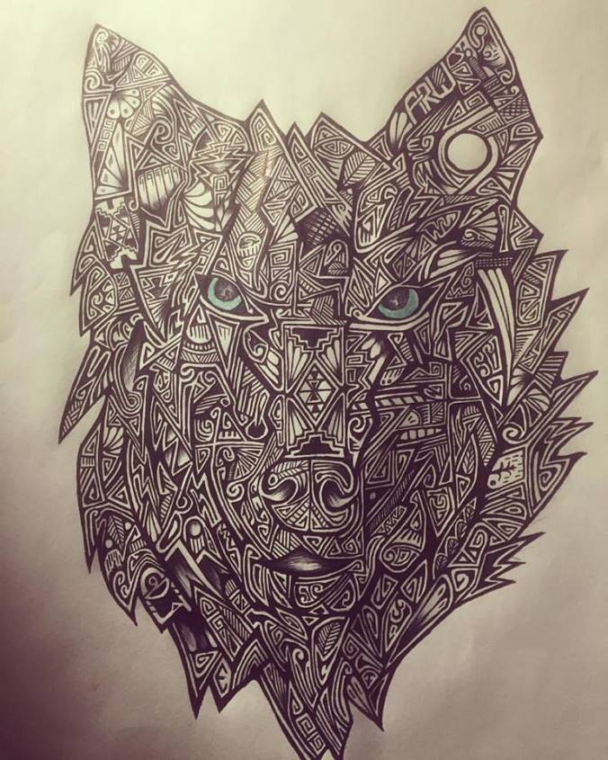

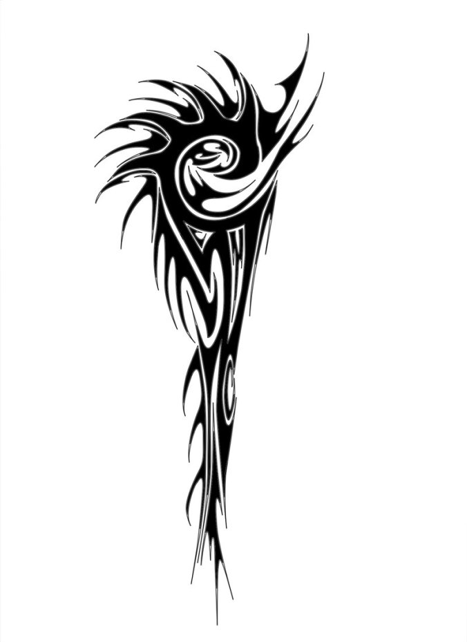
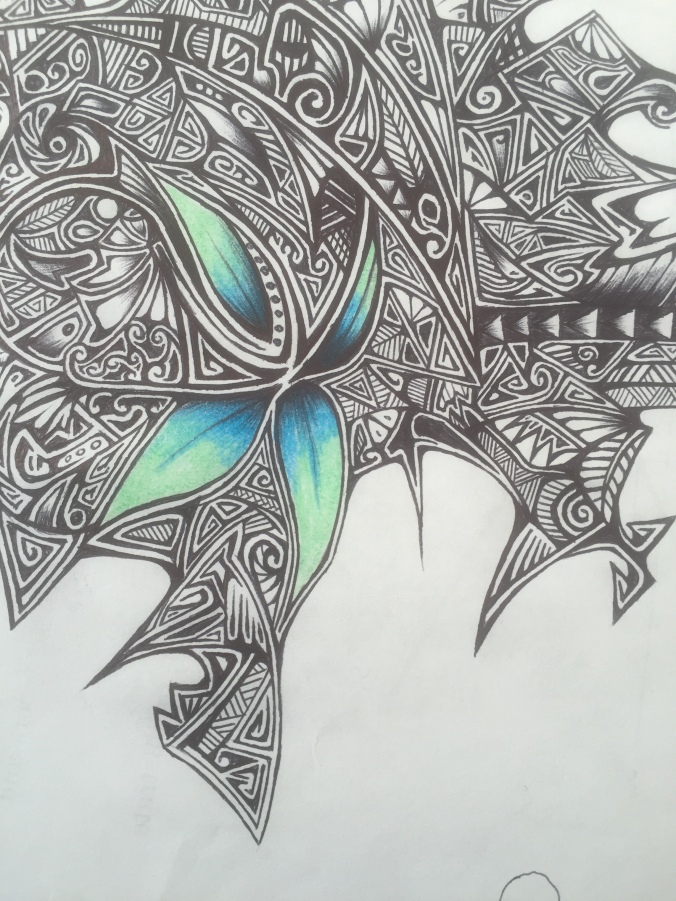


Image Sources:
three of the images are my own personal image
http://www.greenworld365.com/
http://www.deviantart.com/browse/all/?q=Tribal
Slide Design
Speaker Outline:
Take the Field
-Take the field with confidence
-Own it
-The graveyard is our past
The Past Is How We Got Here:
-The men that died here are our brothers
-We are linked to them
Show your Heart:
-Always show who you are
-Show your integrity
We Wont Be Defeated:
-Dont accept defeat
-Dont give the other team the advantage
-Grit your teeth to the end
Play Hard:
-Dont quite until the end
Rise From the Ashes Grab Glory:
-Be winners
-Because of our past we are winners
-Take 1st place
-We are Marshall
Link to Speach- https://www.youtube.com/watch?v=SjoWmFYiNP
The talk I uses was one out of We are Marshall the movie.

Process:
As I was looking for a project idea with regards to a talk to simplify I searched famous movie speeches. I liked this speech because it was a good movie for one, it was also inspiring and had a lot of good points. This process was surprisingly difficult for me to do. It was hard to find things on the internet to use as graphics. I ended up building my own shapes and designs. The pictures go well with each main point in the talk. I feel like if I were to give a talk with this power point I would be able to use the images to get my point across.
Critique:
Thanks to Ben Harker Christine Settles and Karen Laszko I was able to have good critiques. It was easy to change the info in my project. I changed the wording in one slide, I cut a few words out to make it less wordy. Other than that I didnt change much. I did change the over all look of my project compared to my original sketch. Thanks to those who gave me good critiques.
Title and Body copy- Eras Bold/Eras Medium/San Serif
Event Flier
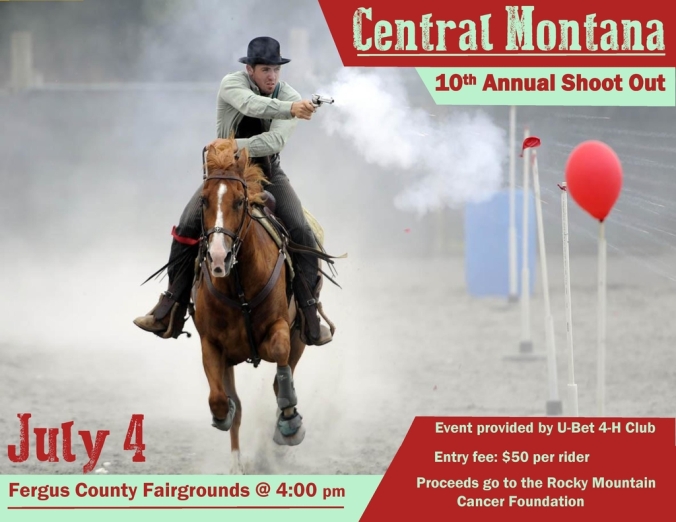

Creation Process:
I decided to build this event flier because it’s something that is unique. This is an event that hardly anyone knows about and it’s really fun to watch. My dad does mounted shooting competitions here and there. That is where I got the idea to do this. It was really difficult to get colors out of this image that was the biggest problem. The color scheme of my project is a complementary color scheme with a chest net red color and a version of green. These colors best fit the image and the color of the horse I tried to pull those colors out. The color names are chest nut red and light green. The audience I was trying to reach was those who are looking for some excitement in their life, people who want to try something different or come watch an even they have never seen before. I felt like the rider shooting the pistol with smoke would capture my audience well.
Critique process:
This was actually kind of painful I really liked the fonts that I had chosen, but then again I’m not building this flier for myself. I did a lot of changing. I had some awesome western style fonts originally that really fit the theme of my project well. I changed that. I changed a lot of colors so they matched the image in my project mostly the horse and the rider. I received awesome feedback from many class members, Chris Armstrong, Karen Lazko, Christine Settles and Natalie Sumsion. Thank you for the good feedback.
Color Scheme: Complementary, Chestnut red and a version of green
Title: Dust West-decorative, Body copy: Franklin Gothic Demi (san serif)
